— — —
01 The Challenge
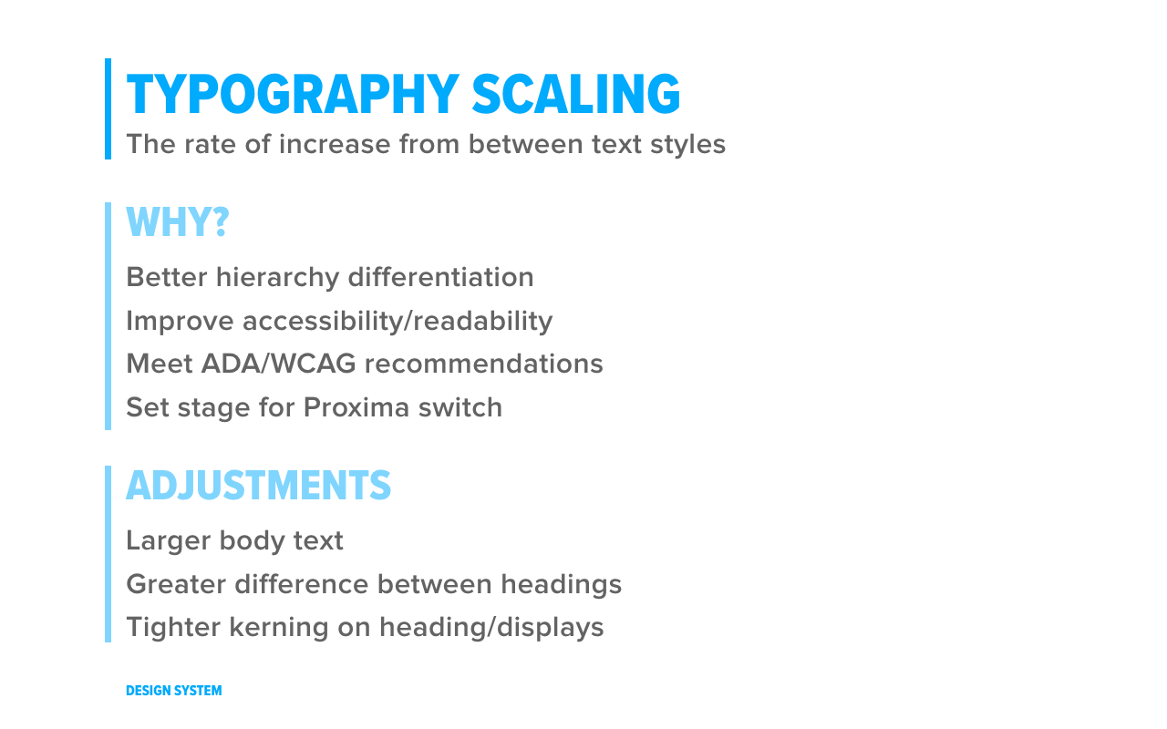
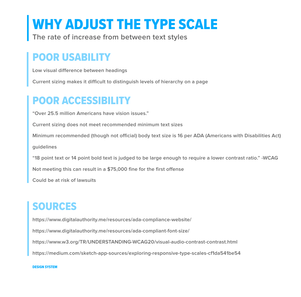
The challenge was simple enough: improve the enterprise typography. It was too small for users, had too may unused styles, and used additional font licensing that could be cut to save money.
The process:
- Define the problem
- Audit what's there
- Explore options
- Design the solution
- Plan the release
— — —
02 The Process
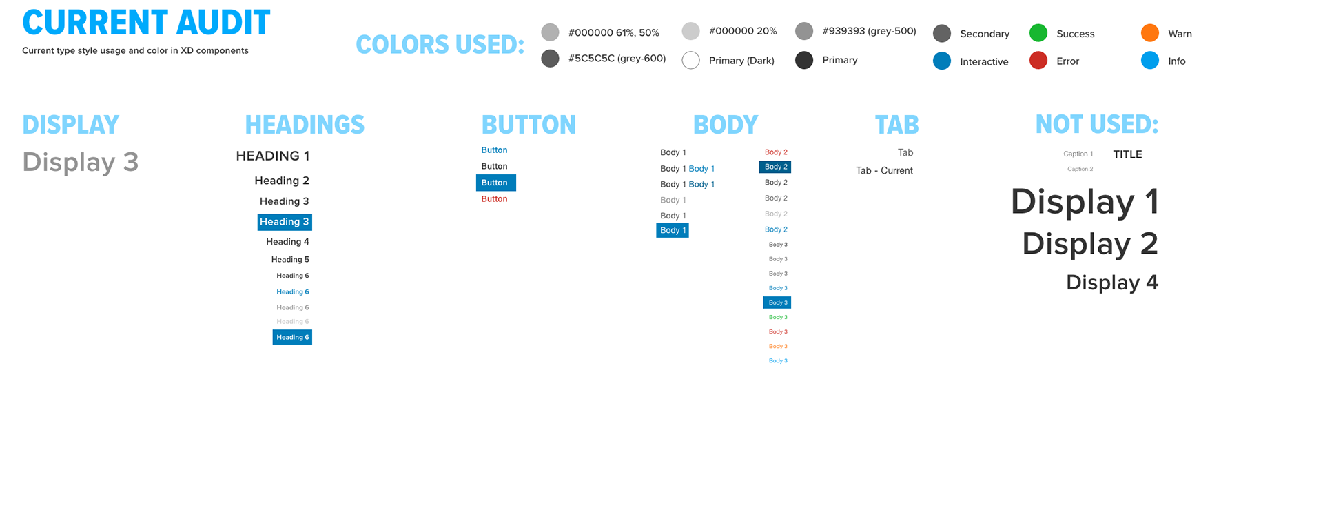
First things first, I conducted an audit to see what was being used where and why.
In switching some styles from Helvetica to Proxima, I wanted to know the visual impact, so I created this comparison of letterforms and the impact on sizing.
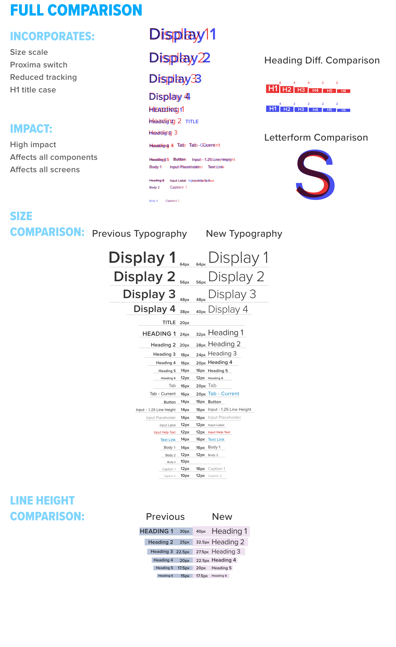
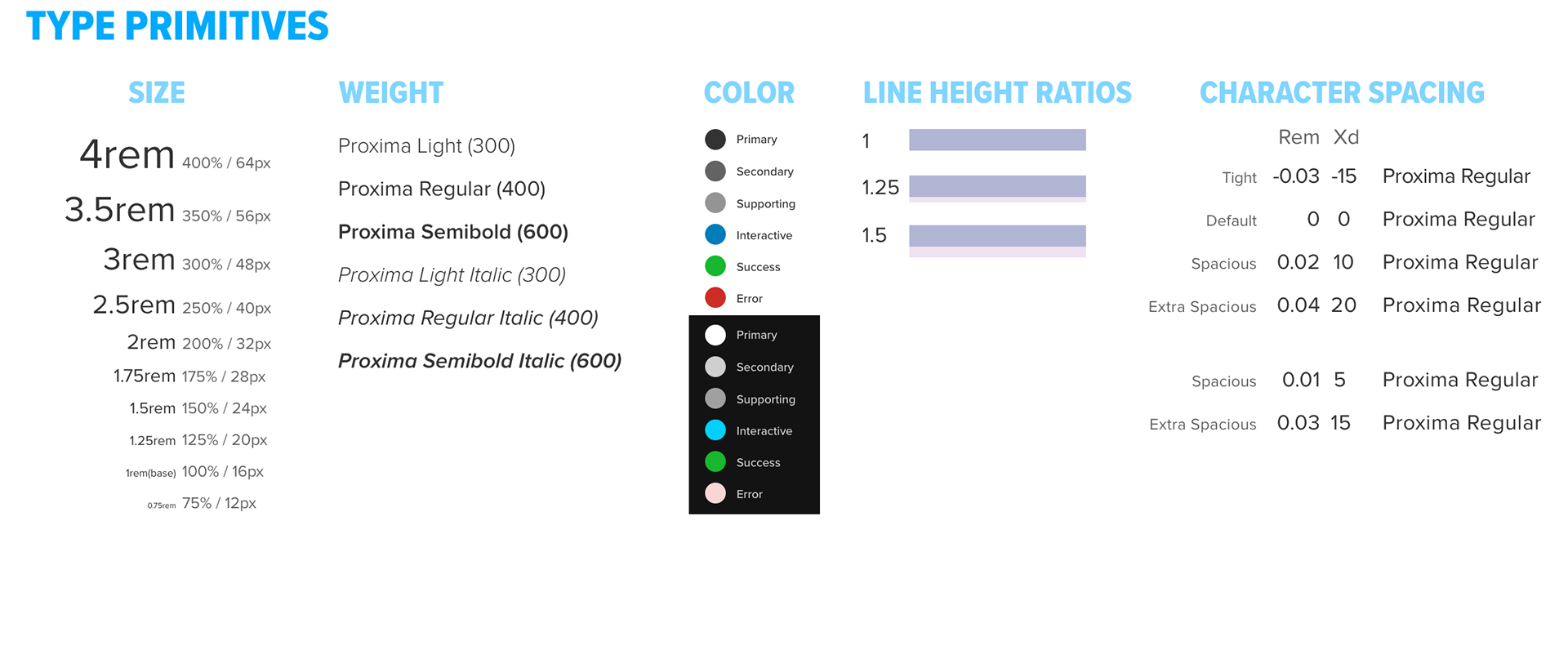
Next came a consolidation of all the primitives (or core elements) that would make up the new system.
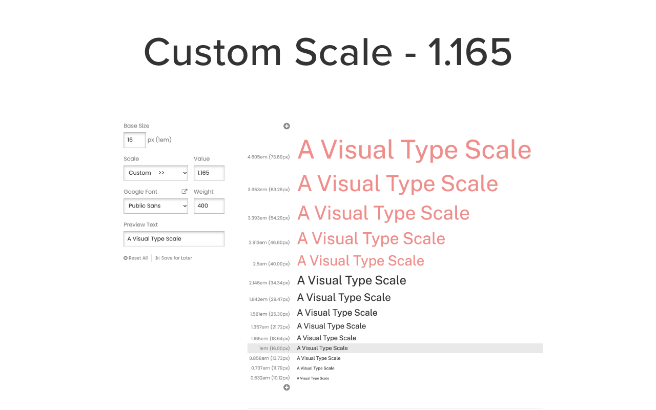
After exploring existing typography scales, I determined that a custom scale was best for this enterprise.
— — —
03 The Results
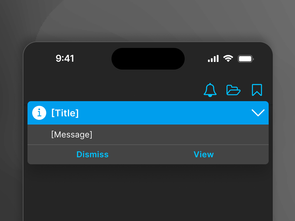
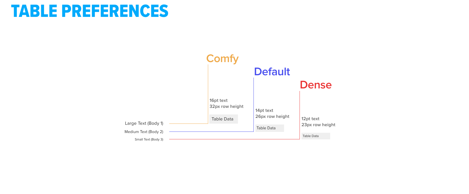
These products used a lot of tables. Often users would want more data so additional table cell preferences were created.
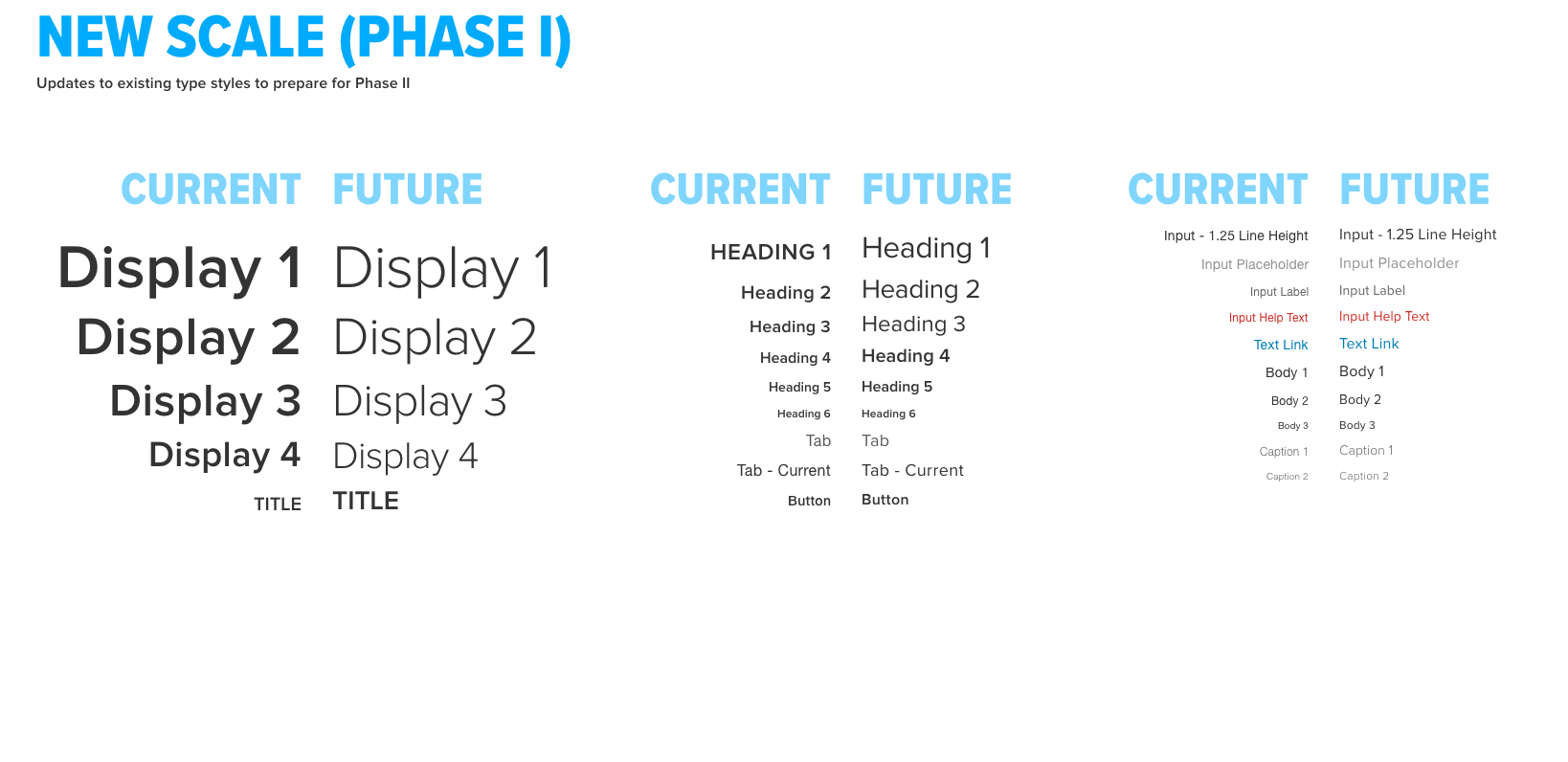
For an iterative rollout, the first phase involved swapping to Proxima exclusively and removing Helvetica.
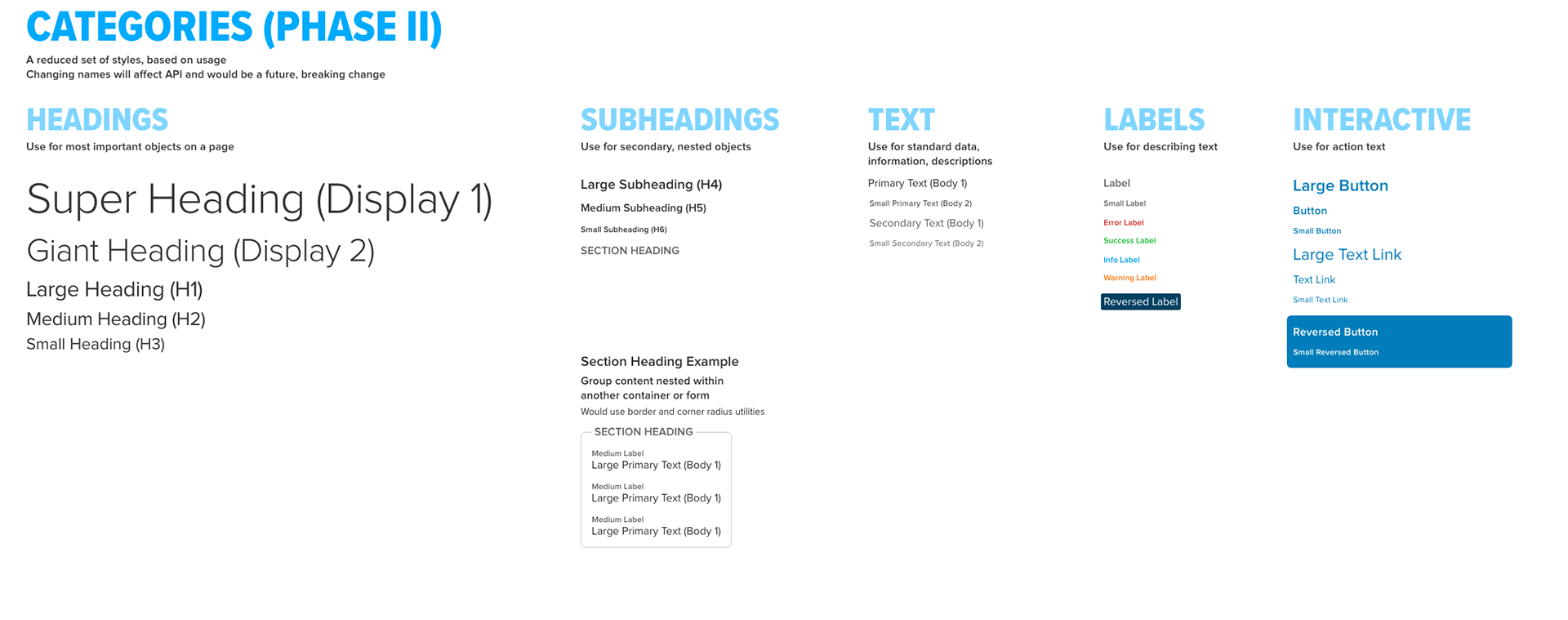
For the second phase, typography styles were simplified based on usage.
Finally, a summary of changes and recommendations.