— — —
01 The Challenge
Color tokens had been used, but not always for what they were intended. This made maintenance tricky and use of the color system challenging. The goal here was to consolidate all of the color tokens that had been added over the years and simplify things into a language that designers and developers could understand.

I was working with an existing enterprise system so I wanted to keep in mind that dramatic changes could cause disruption to the apps.

— — —
02 The Process
Like so many things, it started with an audit. I looked at all the tokens and different states of all components, then grouped those into similar categories, noting areas where changes would need to be made.

— — —
03 The Results
Big companies have big needs. For the color tokens, a system of five categories was developed to allow for the flexibility and scalability of a big design system.

Foundation and Semantic tokens form the structure that allow the design system to be white-labeled, meaning other companies can plug in their brand colors and fit right in.


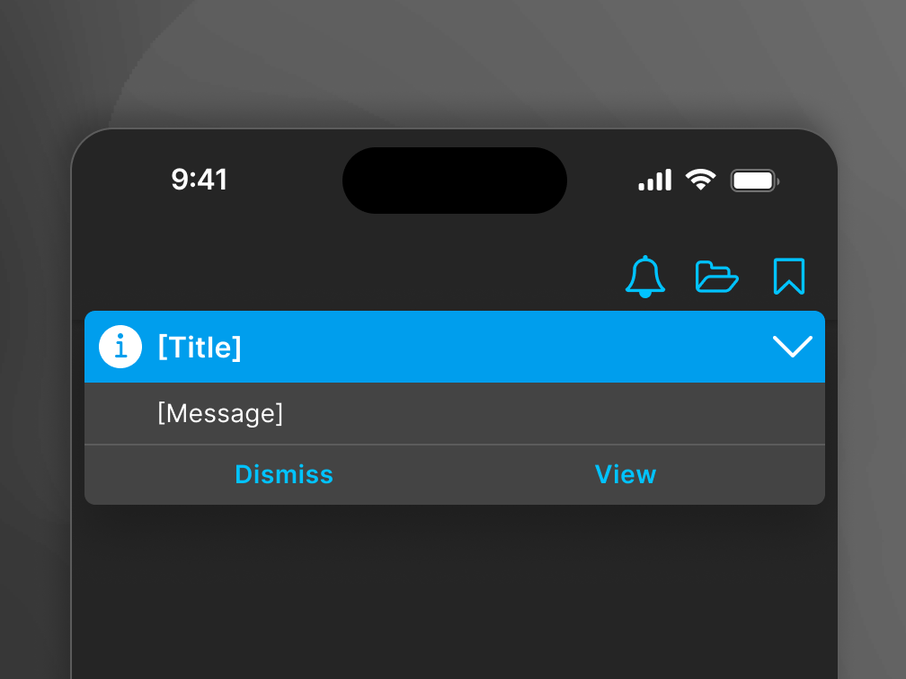
Designers struggled to know what colors to use for backgrounds, borders, and text. A simple category of "System" tokens was made.


Sometimes a system needs to support customization, new components or patterns. The "Common" category was made so teams can visually match existing design system elements.


Finally, designers and developers need to be able to add new tokens for certain scenarios and keep things clean and understandable. This naming system was developed so teams know exactly what to name their new tokens.

Designers and developers are busy enough. Tokens were refactored into existing components in Figma so no additional work was needed to convert to the new system.